When it comes to designing effective HTML emails, even the most competent designers and marketers can find themselves feeling frustrated.
While it’s true that email clients like MailChimp and Constant Contact have made it much easier to design nice-looking, readable emails – even if you have absolutely no HTML skills – there are plenty of tips you can follow that will help you take your emails to the next level.
Here are a few from MZ’s own email marketing gurus.
Don’t go wider than 600 pixels
Making your readers scroll side-to-side is the kiss of death for your emails. Not only will it make your brand look amateurish, but it will also prove really annoying to everyone who gets your emails, making it way more likely that they’ll just send them straight to the trash.
To avoid this, 600 pixels is a good standard to stick to. In addition, keeping things consistent will make it more likely that your emails will show up well across all email clients (and there are hundreds, even though most people only use one of the few big ones).
Keep important stuff on the left side
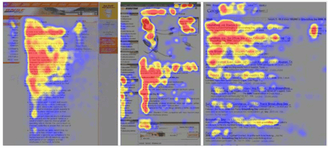
Eye-tracking studies have proven that people tend to focus more on the left side of the screen than the right. To put a finer point on it, most web users look in an F-shape – they’ll look at a headline, and then mainly focus on left side and a little way into the text as it moves toward the right.

Source: Kissmetrics
This is, of course, why sidebars are usually on the left side of the screen.
What does this mean for your emails? While focusing on the left side should never mean sacrificing a pleasing design, you may want to scan your email templates to see if you can optimize them with this in mind.
Readers focus more on the left side of the screen - which makes that a good place for your call to action. #emailmarketing Share on XFor example, where are your calls to action?
Are you keeping the most important information toward the top?
Where are you placing your images?
If you’re not getting the follow-through from customers that you want, moving some of these design elements around is a good step to try.
The “above the fold” imperative is a myth
The idea that information has to be “above the fold” – above the point at which a user will have to scroll down – if you want the majority of readers to see it has been popular since the early days of newspapers.
In the newspaper world, the day’s most important stories (or the ones that were likely to sell the most papers) were placed at the top of the front page, so that customers would see them when the paper was folded and put out for sale.
The term was co-opted for the web design world and most web designers have advocated putting important information above the fold since a 2006 Nielsen study found that 77% of website visitors won’t scroll down.
But since then, it’s been found again and again that people do, in fact, scroll. So while it’s still important that key information is placed above the fold, there’s no need to worry that users will ignore most of what’s below it.
“Above the fold” is largely a myth. People will scroll if you give them something valuable. #emailmarketing Share on XHowever, calls to action should be placed at the top
There’s a caveat to the above the fold issue for emails.
Since most users decide whether or not to read your email from the quick preview they get after clicking on it, you do want your calls to action to be both effective and placed toward the top.
Assume your images will be blocked

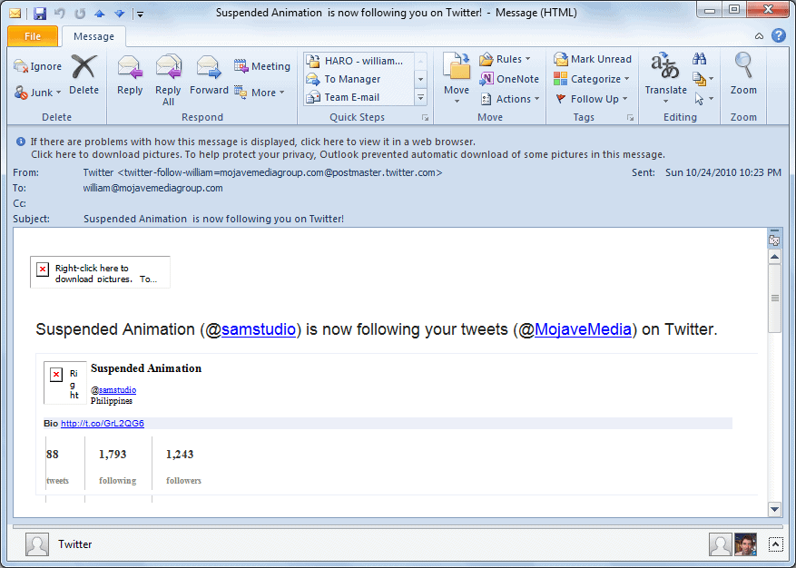
Source: Windows IT Pro
Even though it’s 2017, and you’d think we’d be past this automatic email image-blocking thing, most email clients – 60%, according to Mailigen – still block images by default.
So instead of relying on your images to make people read your emails, focus on ensuring that your copy and headlines are compelling all on their own.
You should also make sure you have descriptive alt text for each image – you never know when the alt text will entice someone to take the extra 30 seconds to download your images.
Remember that a huge percentage of your readers will be opening your emails on mobile devices
Mobile usage is outpacing desktop usage and has been since 2015. If your emails aren’t optimized for mobile and tablet viewing, you’re likely missing out on a huge percentage of your potential readership.
How do you optimize for mobile? Here are just a few ways:
- Make sure any buttons or calls-to-action are big enough to use on a touchscreen
- Keep text to a few lines or less
- Utilize white space
Test, test, and test again
You know that readers will see your email differently depending on the email client and device they’re using. The only way to ensure that your email shows up clearly for as many readers as possible is to test it.
The most important test is for mobile – check out your email on your smartphone and tablet first. Then move onto web-based programs like Gmail and Yahoo, as well as clients like Outlook and Apple Mail.
Most email programs have test modes that allow you to see how your email will look in a variety of different programs. If yours doesn’t, for some reason, send a few emails out to friends who use different email clients, and solicit feedback.
Include links to your social media profiles
Since you’re working with a captive audience, in a sense, you want to make the very best use of the few seconds – a minute, if you’re really lucky – that you have their attention.
That means including links to all your social media profiles in each email. They can be small icons, like you have on your website, or you can direct people to your profiles with text links to specific posts.
Give email recipients as many opportunities to engage with your brand as possible. #emailmarketing Share on XWhatever you choose, the goal is to give people as many options for engaging with your brand as possible. Some customers will prefer seeing you on Instagram. Others will ignore those icons altogether, and stick to email.
The important thing here is that you’ll be giving people in both those groups something they want, so they’ll be more likely to engage with your brand in the future.
Include several links to the same page
If you’re trying to direct people to your sale page, or to your latest whitepaper, or that new webinar you just created, don’t just link to it once. Link to it multiple times, using different – but still clear and recognizable – language.
You want to persuade as many people as possible to visit the page you’re focusing on and using varied wording, sentence structure, and context will ensure that your message appeals to a wider, more diverse group of readers.
Be brief
Every writer knows that editing is one of the most difficult, and yet most important, part of the writing process.
Believe it or not, that’s just as true with an email as it is with a novel. Edit your text down more than you think you have to – many marketers say a good challenge is to edit your emails down by half.
Creating awesome HTML emails doesn’t have to be a chore. For more on using email marketing to grow your business, read “Insane Stats That’ll Make You Rethink Your Email Marketing Strategy.”


