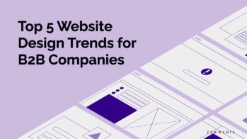
Redesigning Your B2B Website in 2024? You’re Not the Only One.
Businesses are looking to embrace bold changes this year that redefine their brand and provide a fresh look and experience for their customers. Websites are beginning to include more self-identification services that offer personalized experiences, like Prose, Aura, and Function of Beauty, which are dominating the haircare industry by providing customers with unique formulas for products based on their routines, lifestyle, and personal needs.

In design, clients are looking for an elevated aesthetic experience that has the look and feel of 2024—quick, efficient, and bold. To stay ahead of the curve, it’s crucial to keep up with the latest web design trends to keep your website (and company, for that matter) from feeling dated, clunky, and overall irrelevant.
Related Reading: 15 B2B Web Design Trends for 2023
Here’s a look at what’s trending in B2B web design this year:
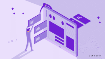
Top B2B Website Design Trends
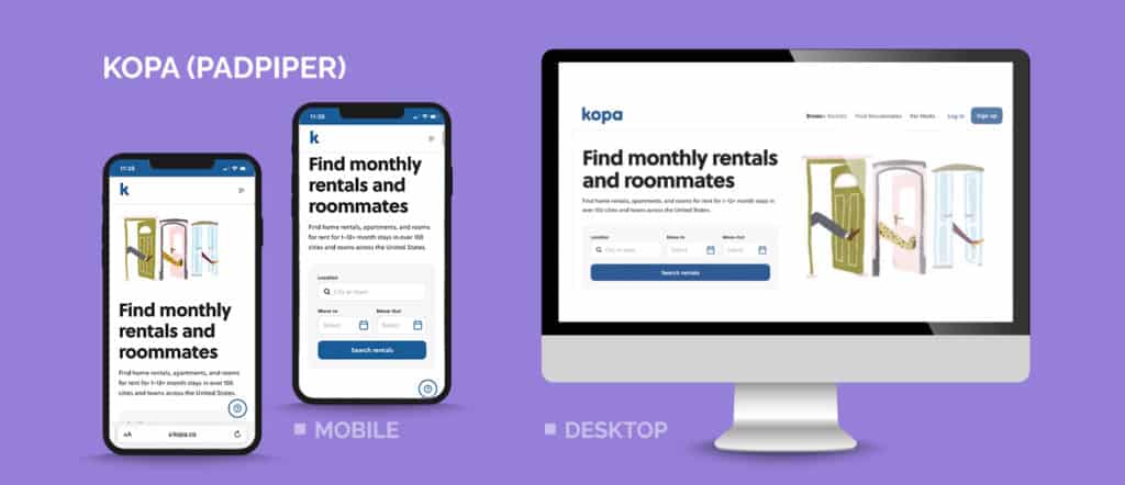
More App-Like Experiences
If you think about how most of us spend time on the web these days, much of it is done using apps where there’s a heavy focus on user experience and interaction.
Who says a B2B website can’t resemble the apps we know and love? Features designed to give clients a fun, interactive experience are becoming more popular for one simple reason: people like them. They’re a great way to keep a potential customer on your site for a longer stretch (which increases the chance of conversions, of course).
Give them something memorable, and improve their perception of your brand while potentially moving them through the funnel.
Related Reading: 6 Apps That Can Help Small Businesses Compete Against the Big Guys
Simplified Navigation Menus
Gone are the days of cluttered and complex navigation menus. In 2024, the focus is on simplicity and ease of use. The strongest websites are opting for simplified navigation menus that showcase only the most essential pages and options and streamline user experience and direction.
This approach not only enhances the experience for the user but also ensures that visitors can quickly find what they’re looking for. Minimalism is key, and with clear and concise labels that guide users effortlessly through the website, they are less likely to get distracted from completing their purchase of your product or service.
Related Reading: Zen and the Art of Website Maintenance
The One-Page Website
Our creative director, Jacob Hovanec, is a huge fan of the one-page website. These can work for product pages, landing pages for specific audiences, CTA landing pages for your paid ads, and more.
Related Reading: Landing Pages That Actually Convert (And How to Make Your Own)
One of the biggest advantages of these one-page sites is that they’re a simple way to get your message across to new visitors who don’t know anything about your brand. Rather than overwhelming them with information, you can give them what they need to know fast and in an easy-to-digest way.
Single-page websites are also more mobile-friendly than clicking through links or tabs to find more information. Given that mobile browsing is preferred over desktop searching, condensing your brand’s information into one page is a huge plus. Your customers will thank you.
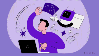
Responsible Motion Design
Motion can be a fun way to add visual interest to your site, but it needs to be used in the right place at the right time. Too many dazzling (read: distracting) visuals that don’t add to the user experience can cause eye strain or overwhelm them—motion, for its own sake, is a mistake.
This is partly due to the massive increase in video content over the past several years. With so much movement across the web, designers must be selective and intentional about how they incorporate it. Every animation and video should serve a clear purpose and be just enough to grab the user’s attention while reinforcing your company’s branding.
Related Reading: Sleek and Cool – Design in a Service World
Optimize for Mobile Devices
This B2B web trend is absolutely imperative.
Mobile-friendliness is, and will continue to be, one of the biggest web design trends and a must-have for B2B websites. As of January 2024, nearly 60% of all searches were performed on mobile devices across the board—including both B2B and B2C. Customers being on the go, and therefore on the internet, is a universal truth nowadays. People are active online, even in the grocery store checkout line or in traffic at a red light.
Websites that aren’t mobile-friendly result in revenue loss. Because people do not have patience for long load times or ancient-looking HTML sites that are impossible to navigate on the go, they will simply click off them rather than waiting for them to fully load (Netflix may have triggered an entire generation with their endless buffer-sign…).
Related Reading: The Demand Generation: What It Is and Why You Want to Be A Part of It
Additionally, websites built with smartphone users in mind provide the best overall experience with smarter design choices—minimalism, concise messaging, and clickable interfaces.
If your website isn’t optimized for mobile, potential customers are far more likely to leave than they are to suffer through an unappealing experience. What’s more, not ensuring your website is mobile-friendly could affect your placement in the search engine results pages (SERP). Many B2B SEO experts believe that Google penalizes sites that aren’t mobile-optimized.
We’re not saying your website on mobile vs. desktop has to be identical, but a user-friendly mobile option leveraging a responsive design will make a difference in prospects staying on your site.
Related Reading: The Rise of Visual Content Marketing: 5 Reasons Infographics Rock
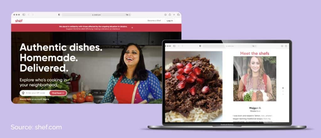
Grainy Gradients on Images
Gradients on their own tend to invoke shiny, slick, futuristic perfection. Adding a grainy texture to gradients, however, gives the visual elements on your website a completely different feel, making the effect more natural and even nostalgic. You can even add subtle shadows to make the colors look like they have more depth.
This web design trend adds a touch of uniqueness and personality to a website. It can help create a visually appealing and memorable user experience. By combining the sleekness of gradients with the imperfections of a grainy texture, designers can achieve a balance between modern aesthetics and a more organic feel.
This trend can be particularly effective for websites in industries that want to convey a sense of authenticity: think fashion, food, or lifestyle brands. By strategically placing shadows or highlights, designers can create an illusion of three-dimensionality, making the images pop off the screen. This technique can enhance the overall visual impact of a website and make it more engaging to users.
Related Reading: 8 Ways to Make Your Social Media Images Rock
Fun Effects
One of the most beautiful web design trends is glass morphism—using a combination of transparency, blur, and movement to make an image look like glass. When used strategically, it can make sites or apps appear more attractive to users.
To achieve the glass morphism effect, designers can use CSS properties like backdrop filter and blur to create the illusion of transparency and depth. Designers can use this effect in anything from logos and branding to website design. You’ll just want to ensure that the glass effect doesn’t affect the accessibility of your text. This trend adds a modern and sleek aesthetic to websites, making them stand out and capture the attention of users.
Related Reading: To Rebrand or Not to Rebrand: A Guide for Businesses at a Turning Point
Vibrant Color Schemes
Color plays a crucial role in setting the mood and tone of any website, and current trends lean towards vibrant and eye-catching hues. Designers are moving away from traditional, neutral color palettes and embracing more unconventional and attention-grabbing combinations. Bold colors can make a website feel dynamic and energetic, instantly capturing the user’s attention.
Related Reading: Everything You Ever Wanted to Know About Using Color in Marketing
Some popular vibrant color schemes include neons, gradient color transitions (but you knew this already *wink wink*), and contrasting color combinations. Neons are particularly trendy, as they create a bold and futuristic look, while contrasting color combinations, such as pairing a bright color with a neutral or complementary color, can create a visually striking effect.
When incorporating vibrant colors into your web design, it’s important to consider your brand’s identity and target audience. Choose colors that align with your brand’s personality and that evoke the desired emotions in your visitors. For example, if you’re targeting a younger audience or a creative industry, using vibrant and playful colors may be more effective. Start with identifying who you’re talking to (as with any successful marketing initiative) and build from there.
Related Reading: Why Digital Market Research Matters
Cinematic Scrolling
One of the modern trends in web design is cinematic scrolling. This technique creates an immersive experience by using smooth animations and transitions as users scroll through the website. It brings a sense of storytelling to the design, engaging visitors and encouraging them to explore further.
Cinematic scrolling can be achieved through various methods, such as parallax scrolling, where different elements of the page move at different speeds, creating a sense of depth. This technique is especially effective in showcasing products or telling a brand’s story.
Additionally, vertical scrolling with full-screen sections and compelling visuals can create a captivating narrative. By incorporating video backgrounds, bold typography, and interactive elements, websites can create a cinematic feel, leaving a lasting impression on visitors.
Prioritize Page Speed
We can’t emphasize this enough.
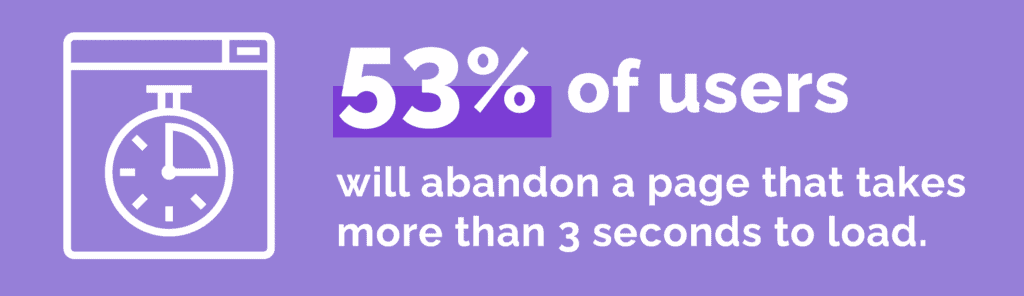
53% of users will abandon a page that takes more than 3 seconds to load. Brands can’t afford to lose customers in this way. In an increasingly digital consumer landscape, ignoring page speed is one of the biggest mistakes a company can make.
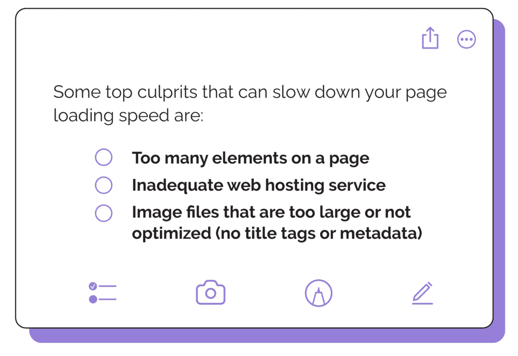
Some top culprits that can slow down your page loading speed are:
- Too many elements on a page
- Inadequate web hosting service
- Image files that are too large or not optimized (no title tags or metadata)
Related Reading: Improve Your Website’s User Experience: Optimize Mobile Site Speed
If any of these are plaguing your page load times, make sure to address them right away. Even the strongest content can’t shine if consumers give up trying to view it before it fully loads!
Kinetic Typography
Along with moving images, many designers are experimenting with moving text, or “kinetic typography.”
Text that changes as you hover with your mouse, tap a screen, or otherwise guides the viewer’s eyes across a page can help tell your brand’s story or show its personality in much the same way colors, images, and other design elements can.
Bold Typography
Just to be clear: typography is important.
Bold typography has been a popular trend in web design for several years now, and it continues to evolve. Designers are experimenting with unique and eye-catching font choices, using bold and large text to grab attention and create visual impact.
The use of bold typography not only adds a sense of personality to a website but also helps to highlight important information and make it easily readable. This trend is particularly effective for brands looking to stand out in a crowded digital landscape and make a strong first impression on their audience.
Incorporating bold typography can be achieved by choosing fonts with strong and thick letterforms, experimenting with different font weights, and playing with the contrast between the text and background. With a careful balance of font choices, designers can create a visually appealing and memorable website that leaves a lasting impression.
As always, be sure that your typography aligns with that of your brand’s tone, identity, and messaging. You don’t want your page to draw attention because the lettering sticks out in all the wrong ways.
Nostalgic Design
Nostalgia has proven time and again to be a powerful draw for consumers. This is especially evident in marketing initiatives across almost every industry.
Designs that evoke traditional media like print or TV, the ’90s or early 2000s, and the aesthetic B2B web design trends of bygone eras often feel reassuring. This can bring people a sense of comfort when they visit your site, as long as it makes sense with your brand.
Minimalist Design
Keeping things simple and clutter-free allows for a clean and organized layout that enhances the user experience. Minimalist designs focus on essential elements, such as clear and concise messaging, high-quality images, and easy navigation.
The use of white space (or negative space) is a key element in minimalist design. It creates an open and spacious feel, allowing the content to breathe and stand out. With fewer distractions, users can focus on the most important aspects of the website.
Minimalist design also emphasizes the use of bold colors and typography to create visual impact. Vibrant and contrasting colors can draw attention to specific elements, while large and legible typography makes it easy for users to read and understand the content.
Related Reading: The Significance of Your Brand’s Visual Identity
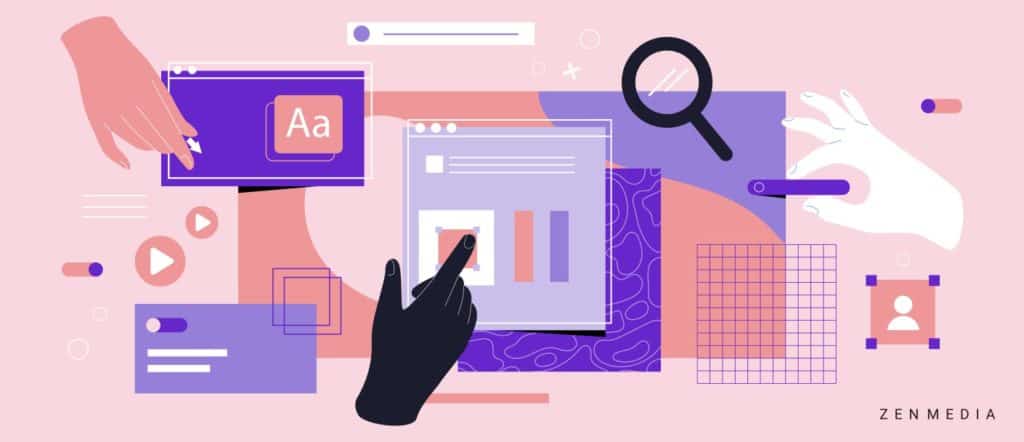
Interactive Features
Interactive features engage users and provide an interactive and immersive experience. Examples of interactive website elements include sliders, video backgrounds, scroll effects, hover animations, and interactive forms.
Sliders allow users to view multiple images or messages in a dynamic and visually appealing way. Video backgrounds add movement and visual interest to the website, making it more engaging. Scroll effects, such as parallax scrolling, create a sense of depth and interactivity as users scroll through the website.
Related Reading: Is This Working? How to Know If Your Marketing Is Any Good
Hover animations add an element of surprise and delight as users hover over different elements on the page. This can include animated buttons, tooltips, or image overlays. Interactive forms enable users to actively participate in the website by filling out forms, taking quizzes, or submitting feedback.
The New York Times leverages this technique often in their articles, including this documentary-style article on the avalanche at Tunnel Creek, another one on the fire of Notre-Dame de Paris, and this particularly powerful one on the impact of school shootings.
By incorporating these interactive features into your website design, you can captivate users and make your website stand out from the competition. And if you do it right, you can create some pretty powerful stories and messaging, as well.
Dark Backgrounds
Dark backgrounds can add a touch of sophistication and elegance to a website. This trend creates a visually striking contrast with the content and elements on the page.
Using a dark background can make colors, images, and text pop, creating a captivating visual experience for users. It also enhances the overall aesthetic and mood of the website, giving it a sleek and modern look.
Dark backgrounds work particularly well for websites that showcase visual content, such as photography portfolios, fashion blogs, or creative agency websites. They create a perfect canvas to showcase vibrant images, products, or artwork.
However, it’s important to ensure that the dark background doesn’t compromise readability. Using contrasting colors for text and other elements is crucial for maintaining legibility and accessibility.
Related Reading: Is Your Website Damaging Your Credibility?
Custom Cursors
Custom cursors are a unique and creative web design trend that is gaining popularity. Instead of the standard arrow cursor, designers are now opting for custom-designed cursors that align with the overall theme and branding of the website.
These custom cursors can take various forms, such as icons, logos, or even animated elements that follow the user’s mouse movements. They add an extra layer of interactivity and personalization to the user experience, making it more engaging and memorable.
Custom cursors can be used to showcase the brand’s personality, create a sense of playfulness, or even provide functional feedback. For example, a cursor that transforms into a magnifying glass when hovering over an image can indicate that a user can zoom in for a closer look.
It’s important to strike a balance when using custom cursors. They should be visually appealing and enhance the overall design, but not distract or confuse users. It’s also crucial to ensure that the custom cursor doesn’t affect the functionality or accessibility of the website.
Related Reading: How To Dominate Your Industry Via Digital Marketing
Let’s Talk!
Now you know what’s trending in 2024! As you’re redesigning your website, consider how incorporating some of these B2B web design trends can help elevate your brand’s look to stay relevant.
Need some help? Talk to the experts. Our creative team is ready to help you develop the perfect digital marketing strategy for your business.