Brand guidelines routinely die in a shared drive nobody reopens after the launch deck. Ask a PR team what ships under a client’s name in a given week, a wire release, a LinkedIn graphic built at 11 p.m., a screenshot a reporter grabs mid-interview, and the answer rarely matches the style guide sitting untouched in a shared folder. What happens to a logo, a color, or a tone the moment it leaves a brand’s direct control?
In 23+ years of building PR strategy around earned coverage, the visual identity failures worth worrying about show up outside the design review: brands that never checked whether their identity holds together once people who don’t work for them start copying, cropping, and resharing it.
This piece looks at what works and what doesn’t, using two rebrands that failed in opposite ways, a soft drink company that just turned its brand guidelines into software, and a scoop of ice cream that out-argued a political spokesperson online.
Inconsistent Visual Identity Has a Measurable Revenue Cost
Brand recognition shows up in the P&L before it shows up anywhere else. In the campaigns I’ve run, the brands that spend the least on damage control are the ones whose colors, tone, and logo read the same everywhere a customer runs into them, a billboard, a conference badge, a screenshot.
Tropicana learned that lesson the hard way. A 2009 packaging redesign that dropped the familiar orange-and-straw image cost the brand 20% of sales and roughly $30 million in two months, forcing a reversal within weeks.
A well-built B2B brand logo survives that kind of stress test because it was built to be recognized at a glance, not admired in a pitch deck. How much of that risk sits in a folder nobody has reopened since the rebrand launched?
Your Visual Identity Breaks the Moment It Leaves Your Building
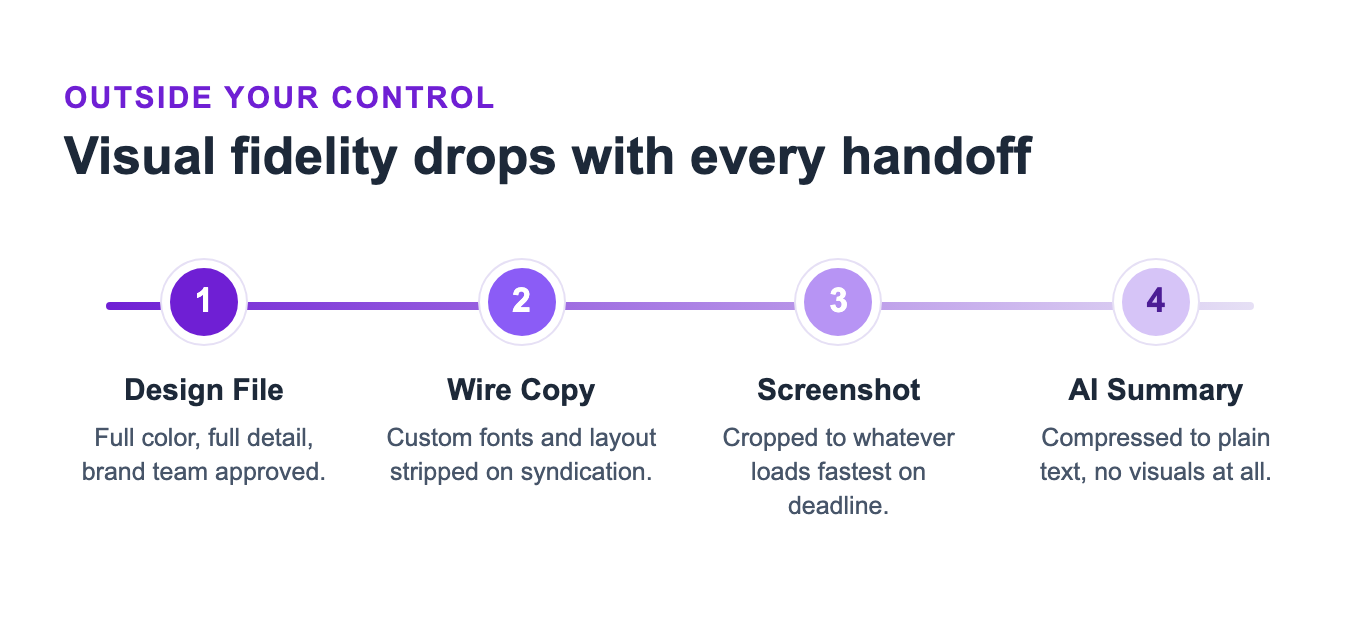
A design file rarely breaks a visual identity. Wire compression, reporter screenshots, and AI summaries do, and none of them happen with a brand’s design team in the room. Few brand guidelines account for any of these three handoffs, even though they decide what recognition reaches an audience at all.
If a wire service strips your fonts and a screenshot crops your logo, what’s left that still looks and sounds like your brand? Reporters and algorithms both reward brands that show up the same way on the record, which is a large part of why a B2B PR strategy built for tier-one coverage starts with identity discipline before a single pitch goes out. The same logic applies to how AI crawlers read a brand’s site before ever showing it to a user.
What a Text Post Taught Dippin’ Dots About Brand Identity
An audience can recognize a brand’s personality even with the logo removed entirely, and that got put to the test when old tweets from a former White House press secretary resurfaced criticizing Dippin’ Dots.
No logo appeared anywhere in that open letter, and the campaign still read as unmistakably Dippin’ Dots because the brand’s personality had been consistent long enough to survive the removal of every visual cue. That is brand equity doing the work a color palette can’t do alone, the same discipline behind other crisis communication examples that turned backlash into a brand asset.
Coca-Cola Turned Its Brand Guidelines Into Software
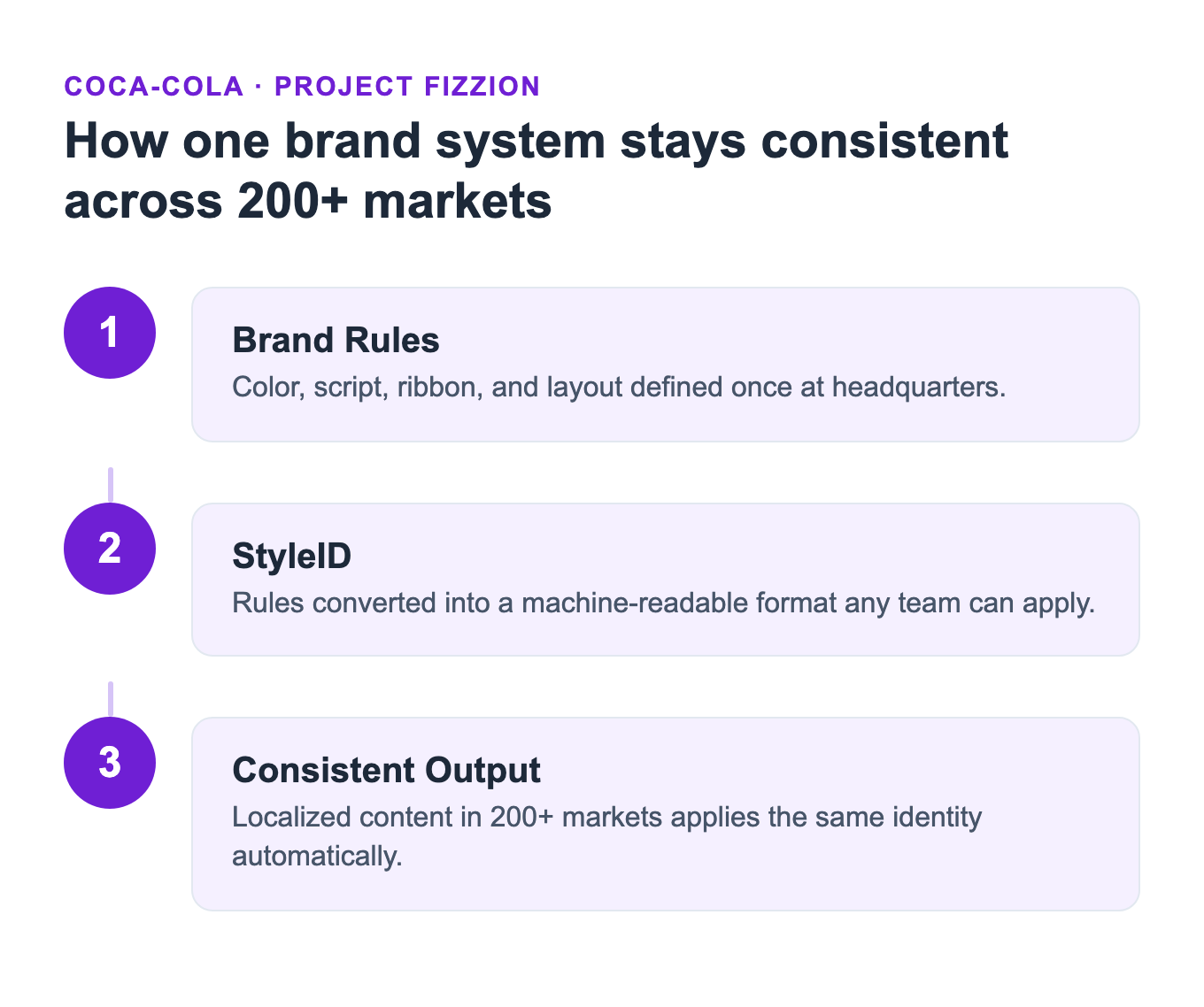
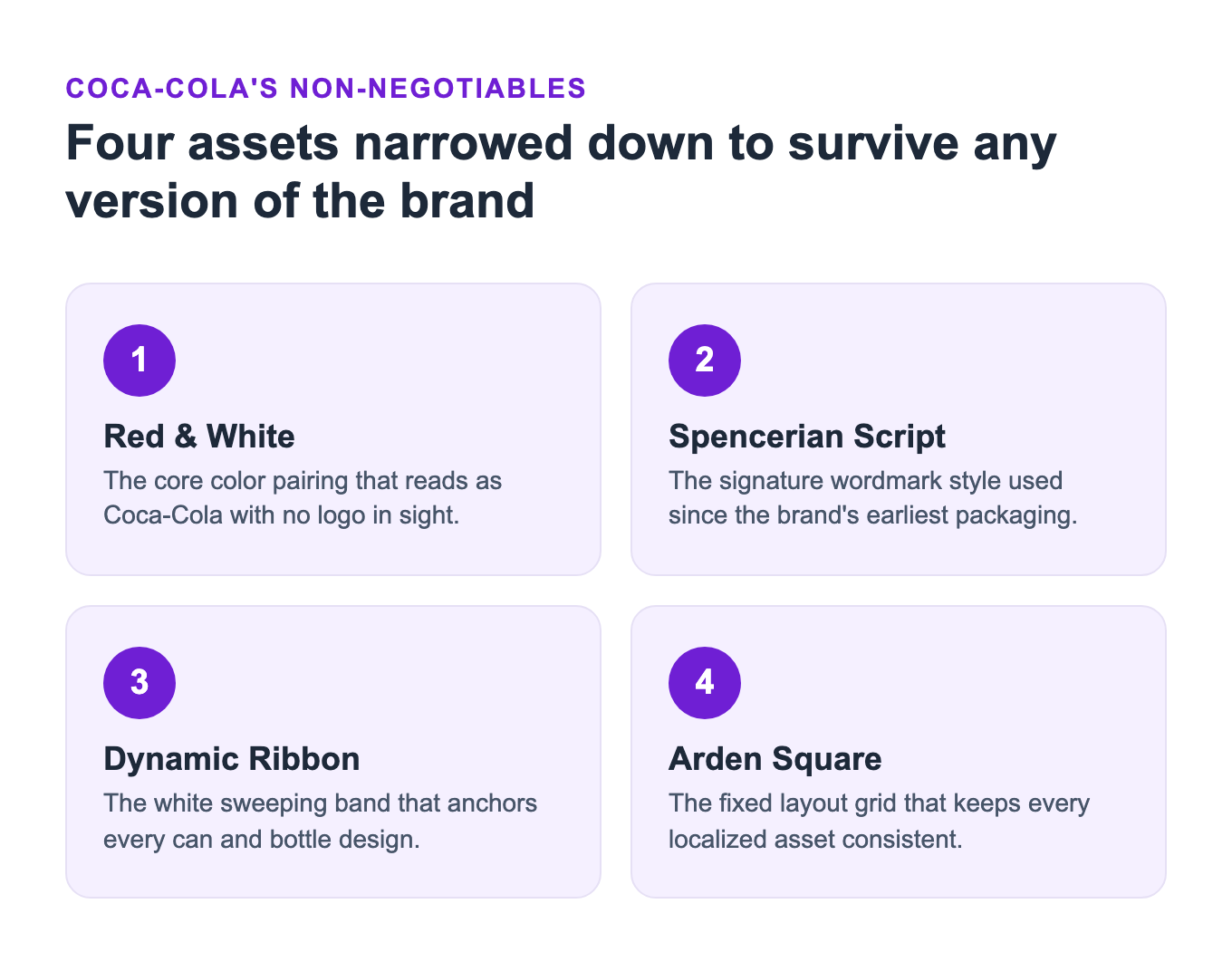
Coca-Cola’s new Project Fizzion solves a specific problem: how does a 140-year-old brand stay recognizable across 200-plus markets without a human reviewing every asset? The company built the platform with Adobe, converting its core visual system, the red and white, the Spencerian script, the Dynamic Ribbon, and the Arden Square, into a machine-readable StyleID embedded directly inside Illustrator and Photoshop.
As a designer works, Fizzion applies brand rules in real time instead of relying on a static PDF nobody rereads before a deadline. Coca-Cola says the system lets creative teams produce localized content 10 times faster without routing every asset through manual brand review.
Not every brand needs custom AI tooling to get a version of that benefit. The underlying discipline, a small, fixed set of distinctive assets applied the same way everywhere, is what Fizzion automates, and it’s what any brand can adopt manually with a shorter, enforced style guide.
Rebrands Fail in Two Different Ways: Too Fast or Too Slow
Gap and X show the opposite ends of the same mistake. Gap moved too fast, shipping a new logo nobody had tested outside the design room, and paid for it within a week. X changed overnight and moved too slow to notice recognition wasn’t following at the same speed, assuming a new name could carry the same weight as one it spent 17 years earning. Both prove a rebrand’s visual system is the easy part; what it costs to change, or to keep, is the recognition built around it.
Gap swapped its 21-year-old serif wordmark for a plain Helvetica logo the week of October 4, 2010, then reversed the decision on October 11 after a wave of public backlash on Facebook and Twitter. The new mark had cleared internal approval without ever facing the audience it was meant to reach.
Then-president Marka Hansen later admitted what the design review missed: “We recognize that we missed the opportunity to engage with the online community.” A logo can pass every internal sign-off and still collapse on contact with an audience nobody consulted.
X has the inverse problem. Three years after Twitter became X, a majority of its own users still call it Twitter. YouGov’s July 2026 tracking found 55% of frequent US users and 79% of daily UK users default to the old name, and 89% of marketing emails worldwide still reference Twitter instead of X.
X’s name change took a day. The recognition built around it didn’t, and the identity never replaced what it deleted. Gap’s mistake was fixable with one review before launch. Nothing could have shortened X’s timeline, because the recognition it needed back can only be earned the same way it was the first time.
Building a Visual Identity That Holds Up Under Pressure
Building an identity that lasts means designing for the version of a brand that gets handled by people outside the building, not the polished version sitting in a PDF. That means checking recognition at the sizes and formats a brand doesn’t control, before a crisis or a wire release forces the question. Zen Media’s rebranding and brand strategy work starts with exactly that kind of audit.
What is brand visual identity?
Brand visual identity is the set of visual elements, logo, color palette, typography, and imagery, that make a brand recognizable across every channel it appears in, including channels the brand doesn’t directly control like press coverage or AI search summaries.
Why does visual identity break down outside a company’s own channels?
Wire services strip formatting, journalists screenshot whatever loads fastest, and AI summaries compress a brand to plain text, none of which respect a polished style guide. A visual identity only holds up if it survives being copied, cropped, and quoted without a design team involved.
Does brand consistency affect revenue?
Yes. Tropicana’s 2009 packaging redesign dropped the familiar orange-and-straw image and cost the brand a 20% sales decline and roughly $30 million in two months, forcing a reversal within weeks. The financial cost of inconsistency showed up immediately, in that case within eight weeks.
What happened when Dippin’ Dots was criticized on social media?
Old tweets criticizing Dippin’ Dots resurfaced from a former White House press secretary, and the brand responded with a playful, on-brand open letter and reconciliation offer instead of a defensive statement. The response drove an 8,000% increase in brand mentions and reached an estimated 1.4 billion people, proof that brand personality is as much a recognition asset as a logo.
Want a visual identity that survives the version of your brand you don’t control? Reach out to Zen Media.
About the author: Sarah Evans is Partner and Head of PR at Zen Media, a global B2B PR and marketing agency. With 23+ years in communications, she architects PR strategy, drives earned media initiatives, and helps brands navigate AI-driven visibility. She is a regular contributor to Entrepreneur and has been recognized as a top writer on business and tech.