If you could make one, summary comment about the evolution of B2B website design, it might be this: We’ve come a long way. And today, your website is one of several viable first points of contact between your business and potential clients. On top of that, the B2B buyer journey is a long one, which means your potential customers may visit your site several times before they make the decision to reach out, much less sign on the dotted line. That’s why it’s crucial to ensure your B2B website is treated like the powerful, persuasive tool that it is. It’s one brand element that can make or break deals, shape perceptions, and drive growth.
So, whether you’re making a new website yourself, hiring talented web designers, or going with a web design agency, let’s take a look at the top B2B website design trends that are reshaping the B2B digital space. Remember, these trends aren’t just about aesthetics (though obviously that helps). They’re a digital marketing tool that’s all about creating meaningful connections, streamlining target audience experiences, and ultimately, driving business success.
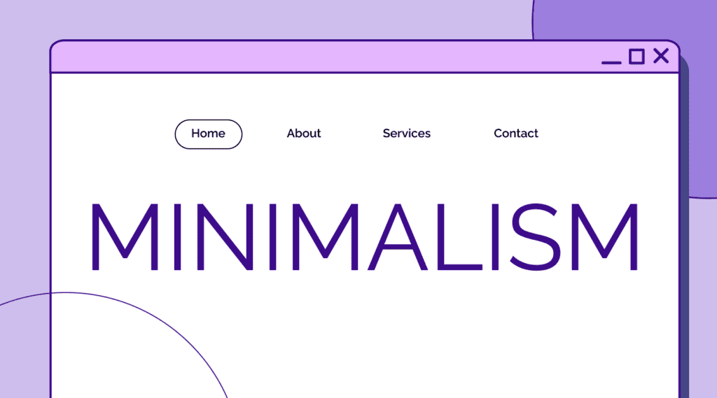
1. Minimalism and Clean Design: Less is More

Early B2B web design was all about two things: fitting information in very small spaces and doing it with a coding framework that is considered pretty rudimentary by today’s standards. Sites were often cluttered with text, links, and flashy (pointless) graphics that pale in comparison to the visual appeal of B2B website design today. They weren’t responsive, and you sometimes had to scroll horizontally to see everything. But this isn’t said with derision—you have to understand where you came from in order to appreciate where you are.
Today, B2B website design is much more streamlined. We’re seeing a significant shift towards minimalism and clean design, resulting in websites that are intuitive, user friendly, and focused on what really matters.
Why Minimalism Works for B2B Website Design
- Improved User Experience: A clutter-free design allows visitors to easily navigate your site. When you strip away unnecessary elements, you’re left with a clear path that guides users to the information they need.
- Faster Load Times: Minimalist designs typically require fewer resources to load, resulting in faster page speeds. In the B2B world, where time is money, a fast-loading website can be the difference between keeping a potential client engaged or losing them to a competitor.
- Focus on Key Messages: With fewer distractions, your brand’s core value propositions, industry expertise, and calls-to-action (CTAs) stand out. This laser focus can significantly improve conversion rates.
- Professional Appearance: A clean, minimalist design often conveys a sense of professionalism and modernity—qualities that B2B clients value highly.
A Note on “Negative” Space
Negative space isn’t, well, negative. The term is a bit of a misnomer in that it really just means “breathing room.” Successful B2B website design doesn’t just work with what’s there but also with what isn’t. This isn’t empty or wasted space, either. It’s purposeful.
We use negative space to improve readability by giving the eye obvious places to rest. Negative space also creates focus, because by surrounding key elements with space—whether it’s a margin, padding, or just the natural gaps between elements—we draw attention to what’s important. Overall, negative space enhances the user experience by preventing visual overwhelm.
Remember, in design, sometimes less really is more.
Implementing Minimalism in B2B Web Design
- Streamline Your Navigation: Simplify your menu structure. Use clear, concise labels and consider implementing a hamburger menu for mobile views.
- Embrace Negative Space: Don’t be afraid of empty space. It helps break up content and makes your site feel less overwhelming.
- Use High-Quality Images Sparingly: Choose impactful visuals that complement your message rather than cluttering your pages with unnecessary images.
- Simplify Your Color Palette: Stick to a limited color scheme that aligns with your brand identity. This creates a cohesive look and feel across your site.
Minimalism doesn’t mean boring. It’s about intentional design choices that strategically lead the eye to what matters most. That, and it’s a digital experience optimization your brand shouldn’t miss out on.
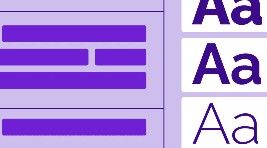
2. Bold Typography and Simple Messaging: Make Your Words Count

In the B2B space, clear communication is a must for online success. Potential and paying customers will want to understand your unique value proposition, successful projects, and get a nearly immediate understanding of how your brand meets or supports their business goals (hopefully better than other businesses) in seconds. That’s why we’re seeing a trend toward bold typography and simple, straightforward messaging. This approach ensures website visitors find your key messages impossible to miss.
The Power of Bold Typography
- Immediate Impact: Large, bold fonts grab attention instantly. In a world where attention spans are shrinking and website traffic moves at lightning speed, this immediate visual impact is crucial.
- Hierarchy of Information: By varying font sizes and weights, you can elevate the customer experience by strategically leading visitors through your content, highlighting what’s most important.
- Brand Personality: Typography is a powerful tool for expressing your brand’s personality. Whether you’re going for authoritative, innovative, or approachable, your font choices can reinforce these traits.
- Improved Readability: When used correctly, bold typography can actually improve readability, especially on mobile devices.
4 Steps for Crafting Simple, Effective Messages
- Clear Value Proposition: Use concise, powerful statements to communicate your unique selling point(s) and brand message. What problem do you solve? How does your solution address your target audience’s pain points? Why should a potential client not just choose you but trust you?
- Avoid Jargon: While B2B communications often involve complex concepts, your website should speak in clear, accessible language. Save the technical details for later in the buyer’s journey.
- Scannable Website Content: Break up text with subheadings, bullet points, and short paragraphs. This makes it easy for busy executives to quickly find the information they need, particularly if they’re viewing your website on a mobile device.
- Emotive Language: Even in B2B, decisions are often emotional. The key thing to know here is that B2B buyers are almost always looking to avoid blame (whereas B2C buyers are almost always looking to avoid regret). So, use language that resonates with your audience’s goals and pain points, keeping an aversion to blame in mind.
Implementing Bold Typography and Simple Messaging
- Choose a Bold, Readable Font: Select a font that’s both impactful and easy to read across devices. Consider pairing a bold sans-serif for headings with a more neutral font for body text.
- Use Font Size for Emphasis: Don’t be afraid to go big with your headlines. Large font sizes can create striking visual interest.
- Craft Compelling Headlines: Your main headings should clearly communicate your value proposition in just a few words.
- Leverage Negative Space: Surround your bold typography with plenty of space to make it stand out even more.
Remember, the goal is to communicate clearly and effectively. Bold typography and simple messaging work together to ensure your key points are understood at a glance.
3. Custom Illustrations and Animations: Bringing Your Story to Life
In the B2B space, we often deal with complex products, services, or concepts. That’s where custom illustrations and animations come in, offering a visually engaging way to simplify and explain your offerings.
4 Benefits of Custom Visuals
- Simplify Complex Ideas: Custom illustrations can break down complicated processes or abstract concepts into easily digestible visuals.
- Brand Differentiation: In a sea of stock photos, custom visuals set your brand apart and create a unique identity.
- Increased Engagement: Subtle animations and micro-interactions can make your website more interactive and engaging, encouraging visitors to spend more time exploring.
- Emotional Connection: Well-crafted illustrations can evoke emotions and create a more memorable experience for your visitors.
Types of Custom Visuals in B2B Web Design
- Explainer Illustrations: Use these to visually represent your products, services, or processes.
- Data Visualizations: Transform complex data into easy-to-understand infographics or interactive charts.
- Icon Sets: Create a cohesive look across your site with custom icons that represent different aspects of your business.
- Micro-animations: Small, subtle movements can guide users’ attention and provide feedback on interactions.
- Hero Animations: Make a strong first impression with an animated hero section on your homepage.
Implementing Custom Illustrations and Animations
At the end of the day, visuals are meant to guide users through your site and highlight key information. While they’re an important part of the design process, remember that while animations and graphics can be engaging, they shouldn’t slow down your website. Always implement graphics that enhance the user experience and don’t distract from your content or weigh down your page load time.
4. Personalization and Interactive Elements: Tailoring the User Experience
One-size-fits-all approaches are becoming obsolete. Buyers expect experiences tailored to their specific needs and interests and, if you’re following marketing trends at all, you know that personalization is big. That’s why we’re seeing a surge in personalized and interactive elements in B2B web design.
The Power of Personalization
When visitors feel the content is tailored to their specific needs and interests, they’re far more likely to engage meaningfully with your website and, by extension, your brand. This increased engagement often translates into higher conversion rates, as personalized experiences can more effectively guide users towards key conversion points.
But the benefits don’t stop there. Interactive elements designed for personalization serve a dual purpose: they not only enhance user experience but also help you gather valuable data about your visitors. This wealth of information can inform and refine your marketing and sales strategies, allowing you to serve your clients even better.
Perhaps most importantly, offering personalized tools and experiences demonstrates your deep understanding of your clients’ diverse needs. It shows that you’re not just another service provider, but a partner who’s invested in their unique challenges and goals.
Types of Interactive and Personalized Elements
- Product Configurators: Allow users to customize products or services to their specific needs, providing instant visual feedback.
- ROI Calculators: Help potential clients understand the value of your offering in real, quantifiable terms. This also helps prove your brand is offering transparent pricing other sites often fail to share.
- Interactive Case Studies: Let users explore different aspects of your success stories and other informative content based on their interests.
- Personalized Content Recommendations: Use data from user behavior to suggest relevant articles, whitepapers, or product pages.
- Chatbots and Virtual Assistants: These provide immediate, personalized support and guide users to relevant information.
Implementing Personalization and Interactivity
- Start with Data: Use analytics and user research to understand your audience’s needs and behaviors.
- Progressive Profiling: Gather information gradually rather than overwhelming users with long forms.
- A/B Testing: Continuously test and refine your personalized elements and the pages they appear on, such as landing pages, your home page, and more to ensure they’re delivering value.
- Respect Privacy: Be transparent about data collection (including clear communication about cookies, lead capture forms, and more) and give users control over their personal information.
- Seamless Integration: Ensure interactive elements fit naturally within your overall design and don’t disrupt the user experience.
The goal of personalization and interactivity is to make your website more helpful and relevant to each individual visitor. When done right, these elements can significantly enhance the user experience and drive better, stronger business outcomes.
5. Mobile-First and Responsive Design: Meeting Users Where They Are

Back in the 90s, 00s, and even 10s, we didn’t have mobile optimized B2B websites. Why? Because cell phones were still fairly new and, honestly, people were still learning how to build websites featuring web designs that actually fit their digital marketing needs and promote business growth. Some of us even remember our old Nokia “brick” phones and Motorola Razrs (and Snake score). Needless to say, their ability to surf the web wasn’t great, and screen size (along with resolution) was a real issue. Frankly, PC monitor sizes and resolutions were also extremely small, leaving designers with a real visual hierarchy challenge that did not translate well into a mobile experience.
Today, all of that has changed. Modern web design needs to be responsive and sites must perform flawlessly across all devices. And with more B2B decision-makers using mobile devices for work, a mobile-first approach to web design is essential.
3 Reasons Why Mobile-First Matters in B2B
- Changing Work Habits: B2B buyers are increasingly researching and making decisions on-the-go, which means there’s a strong chance they’ll be starting their journey on a mobile device.
- Search Engine Preferences: As a part of search engine optimization, Google and other search engines prioritize mobile-friendly websites in their rankings.
- First Impressions Count: A website that works seamlessly on mobile demonstrates that your business is well-run, organized, adaptable, and user-focused. (And it’s another reason why the home page of your website needs to be dialed in.)
Overall, a mobile-first approach often results in cleaner, more focused designs that benefit users across all devices and has a higher chance of converting visitors into paying clients.
Key Aspects of Mobile-First and Responsive Web Design
- Flexible Layouts: Design elements and landing pages that automatically adjust based on screen size, ensuring optimal viewing across devices.
- Touch-Friendly Navigation: Larger buttons and intuitive touch controls for easy navigation on smaller screens.
- Optimized Images and Media: Ensure visuals look great and load quickly on both mobile and desktop.
- Prioritized Content: Present the most crucial information first, considering the limited space on mobile screens.
- Consistent Branding: Maintain your brand identity and key messages across all device types.
Implementing Mobile-First Design
When it comes to implementing mobile-first design, the key is to start small and scale up. Begin your design process with the mobile view and gradually expand to larger screens. To streamline this process, leverage responsive frameworks like Bootstrap or Foundation that are built with adaptability in mind. As you develop, regularly test your website on various devices and browsers to ensure consistency across platforms.
Remember that every mobile user is a potential customer expecting speed, so optimize your site accordingly: compress images, minimize code, and leverage browser caching for faster page load times. Don’t forget to take advantage of mobile-specific features where appropriate, such as click-to-call buttons or location-based services. These can significantly enhance the user experience on mobile devices.
However, it’s crucial to keep in mind that mobile-first doesn’t mean mobile-only. The goal is to create a seamless experience that adapts to the user’s device, whether they’re browsing on a smartphone, tablet, or desktop computer.
Embracing the Future of B2B Web Design
It’s clear that B2B web design is evolving rapidly. That said, a great website is never truly “done.” It should be a living, breathing entity that grows and adapts with your business and your clients’ needs.
Here are five key takeaways to consider as you approach your B2B web design strategy:
- User Experience is Crucial: In the B2B space, where buying cycles are long and complex, a poor website experience can be a deal-breaker. Every design decision should be made with your users in mind.
- Content is Still King: While design trends come and go, valuable, relevant content remains crucial. Ensure your website clearly communicates your value proposition, answers key questions, and provides the information your buyers need.
- Stay Agile: The digital landscape is constantly changing. Regular updates and improvements to your website based on user feedback and analytics are essential.
- Align with Your Brand: While it’s important to stay current with design trends, make sure your website always reflects your brand’s unique identity and values.
- Invest in Expertise: Given the complexity and importance of B2B websites, it’s often worth partnering with a specialized B2B web design agency. They can bring a wealth of experience and ensure you’re getting a strong return on your investment.
In the B2B world, where buyers spend the majority of their journey doing independent online research, your website needs to be more than just a digital brochure. It should be a powerful tool that educates, engages, and guides your potential clients through their buying journey.
By embracing these trends and focusing on creating a user-centric, mobile-friendly, and content-rich website, you’ll transform your website into a critical business asset that can drive growth, build credibility, and ultimately contribute to your bottom line.
A B2B Web Design Agency That Gets It
So, are you ready to take your website to the next level with a future-focused B2B web design agency? Let’s talk about all the ways our expert team can modernize your B2B website design so it drives conversions and growth.


