Let’s say you receive an email from your favorite band. They announced a new tour! As an email subscriber, you get first dibs at tickets, and the pre-sale starts tomorrow. So you click the link in the email, which takes you to a web page with the tour dates, information on where to purchase tickets, and the inside scoop on purchasing tickets with upgraded experiences, like a meet and greet.
You’ve just accessed a landing page.
What is a Landing Page?
Landing pages, not to be confused with homepages, are standalone webpages, usually created for specific marketing or ad campaigns. As a form of targeted conversion opportunities, they address a specific call to action in an email, ad, or social media post. And the more landing pages your company uses, the more leads it will generate.
Research indicates that businesses with 31 to 40 landing pages generated seven times more leads than those with only one to five landing pages. And businesses with more than 40 landing pages? Well, they generated 12 times more leads than their single-digit counterparts.
With that kind of conversation optimization on the line, companies that ignore landing pages or use their homepage as their primary landing page are losing leads left and right. Speaking of which, let’s discuss why homepages are not landing pages.
Landing pages have one purpose, limited navigation options, high commercial intent, and act like a flyer or special insert in a program to bring your attention to something new and exciting. Homepages have a broad focus on brand awareness and messaging, multiple navigation links and points of entry, focus on top-of-funnel leads, and act like a sign in front of a restaurant. In short, landing pages are like special messages to like-minded friends, hastening conversion. Homepages are for everyone, so really, they convert no one.
Using a landing page properly means creating a unique, trackable URL from each source (emails, ads, or social media posts) and engaging users with content optimized for your digital campaign, which leads to higher conversion rates.
There are two main types of landing pages: lead generation and clickthrough. Lead gen pages aim to capture contact information, usually in a form. Whereas clickthrough pages aim to get a prospect to navigate through to another page. Clickthrough landing pages are commonly used for e-commerce brands, given that a prospective customer isn’t likely to purchase anything if they land directly on the checkout page. B2B companies can use clickthrough pages in a similar way, walking prospective customers through their value proposition before having them click through to the pricing page.
With all that in mind, here are nine tips for creating landing pages that convert and a website that demonstrates each.
Nine Tips to Create High-Converting Landing Pages with Examples
1. Make one point.
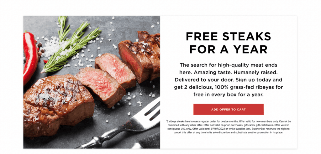
Too often, businesses stuff multiple CTAs into their communications. But having more than one CTA on a landing page will only distract and confuse users. Take Butcher Box, for example. The high-quality meat company makes its CTA clear: sign up for our subscription box and receive two free steaks per box. The landing page repeats the CTA just enough to drive the point home and give users more than one place to convert.
2. Know your target audience.
This might seem like a no-brainer. Isn’t all marketing about knowing your audience? Mostly, but with a specific marketing campaign and a landing page, you’ll want to identify a specific target within your broader market. You might offer a range of products, but to decide which to feature on your landing page (or if they should all be featured equally, for that matter), you’ll need to know who your goal audience is and what features or solutions they specifically want.
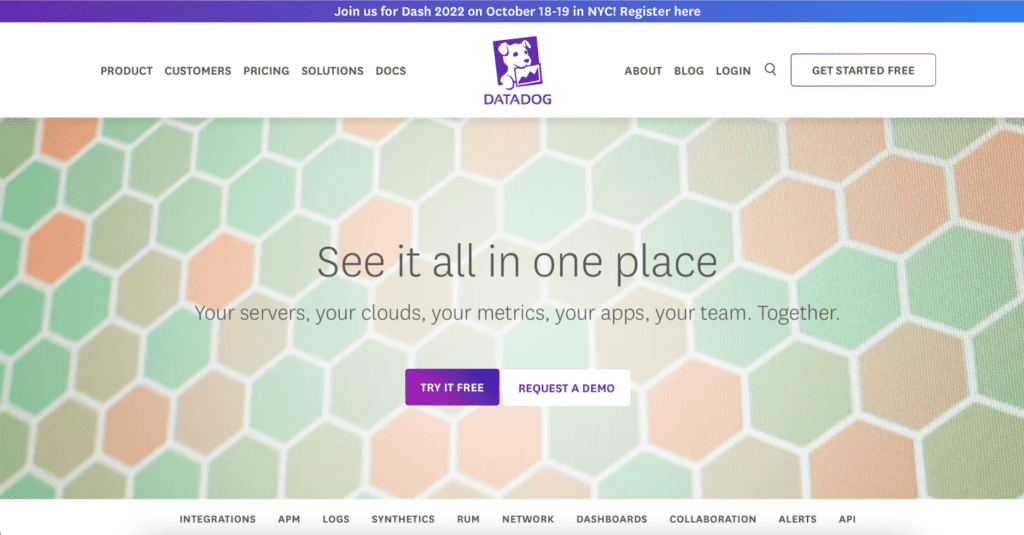
Datadog, a monitoring and security platform for cloud applications, wants to sell its security solutions to companies. So, they offer something that speaks the language of the decision-makers at those companies. In this case, a product brief that explains how Datadog’s synthetic monitoring can eliminate their user’s common pain points. But to get the full brief, users hand over their contact information, generating leads from genuinely interested users.
3. Write a compelling headline.
A clear, concise, and compelling headline will grab the attention of your users. Ideally, in 50 characters or less, you should be able to convey your strongest message to your prospects. A strong headline, coupled with an informed CTA can drive conversion.
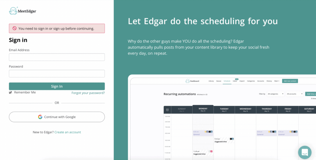
The social media scheduling platform MeetEdgar demonstrates a compelling headline. “Let Edgar do the scheduling for you” tells users that this platform is here to make their lives easier by taking care of small, repetitive tasks—like social media posting—for you so you can focus on bigger things. But it says that in seven words.
4. Highlight your value proposition.
If you want your landing page to convert, you must make your unique value proposition (UVP) clear. Users want to know why you are different from competitors, what benefits you offer, and what they can expect from your product or service. And they want it short, sweet, and packaged in a pretty little bow.
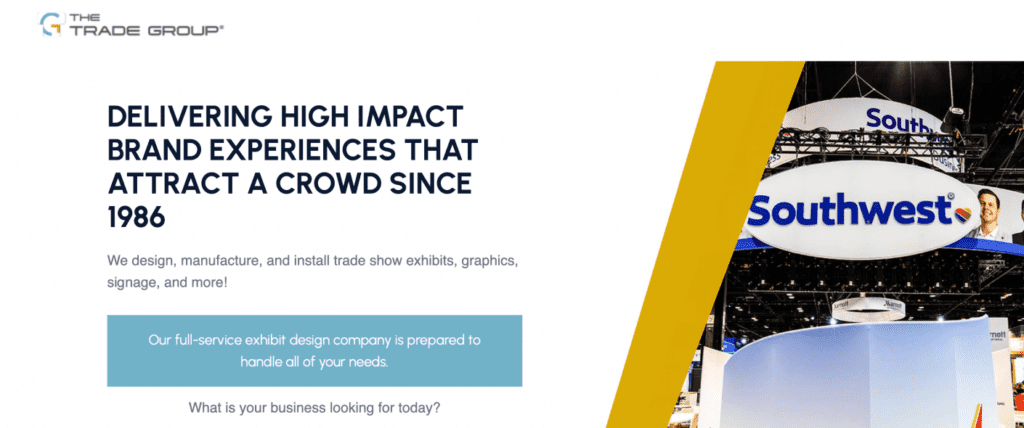
Trade Group, a creative design firm, makes its value proposition clear: creating high-impact brand experiences in a one-stop shop. This landing page offers consumers an immediate way to convey their needs and understand the process. Bonus points to them for also including social proof, which we’ll talk about more later.
5. Create smart form fields.
Lead generation landing pages rely on intelligently designed forms. A simple form can give your company immediate, reliable data on prospective clients. This can usher them through the sales channel more quickly, as it allows brands to create more personalized interactions with their leads.
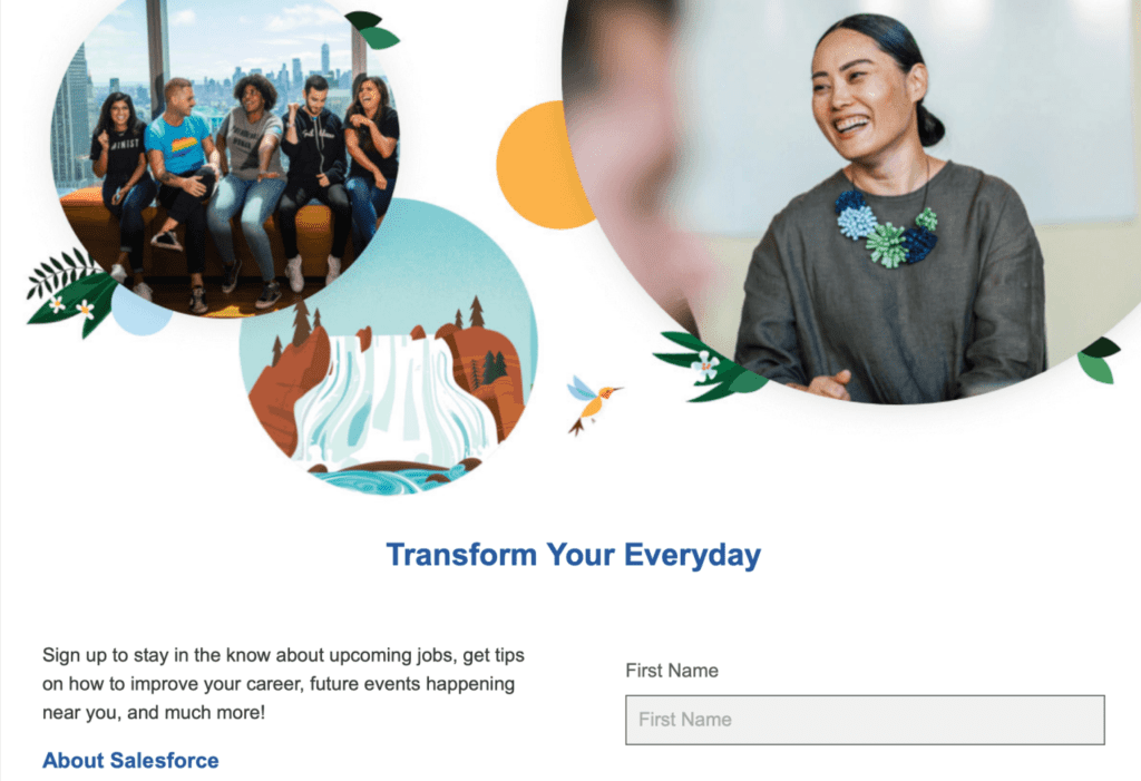
Salesforce uses a form-centric approach to generate leads for employees. It’s simple and clear and allows users to give the company precise data about their years of experience, areas of interest, and previous positions (via a link to users’ LinkedIn profiles).
Related read: 9 Key Lead Generation Marketing Strategies for SaaS Companies
6. Design with intent.
The human brain can process images 60 times faster than text. Having a clear visual hierarchy—telling your users’ eyes what to pay attention to—is imperative for landing page success. Clear differentiation in text size, colors, and design elements will help guide users through your landing page through to conversion. Additionally, using images and video can boost conversion rates by up to 80%.
Toast, a restaurant software company, clearly considered the design of this landing page enticing users to share their contact information for a free course catalog to upskill in the hospitality industry.

7. Create an offer.
Brands can entice users to click with a unique offer. Anything from free goodies, educational content, a contest entry, or more can work.
GoodReads, a free book-tracking service for readers, hosted a giveaway for fans of Ian McEwan to enter to win a copy of his forthcoming release. While it follows some other tips mentioned here—one CTA, know your target audience, and a compelling headline, for certain—it offers fans the chance to win in exchange for their email address (you must be a member to enter the giveaway), which will also opt into other GoodReads email lists.

Additionally, an offer can be educational, like this landing page from Zoom that invites users to sign up for their next webinar.
8. Provide social proof.
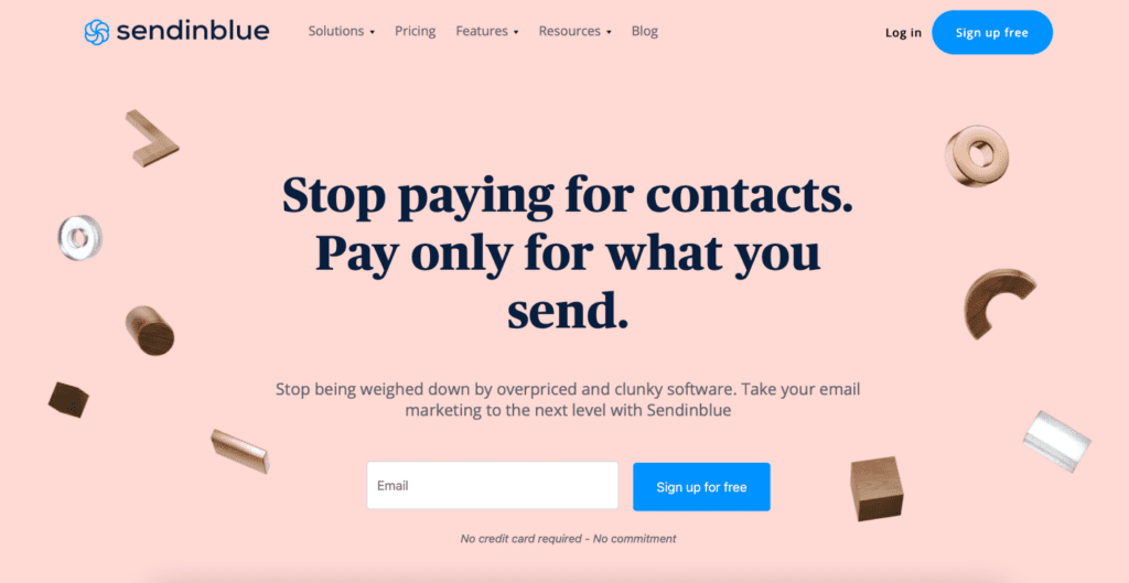
Social proof can come in the form of testimonials, case studies, well-known existing customers, and awards and accolades. Providing your prospective customers with social proof signals that you are already peer-approved. Sendinblue, the communications platform, does a great job of this by highlighting big brand names and more detailed testimonials from everyday customers.
Related read: Here’s How to Build Trust In Your Brand in 2022
9. Optimize for your traffic sources.
One of the biggest benefits of using landing pages in your marketing or ad campaigns is the ability to bring in data. Optimizing landing pages to track source links from your paid ads, social media post, or email newsletter will give you precise metrics. You’ll know who engaged with your content, from where, at what time, and more. Landing pages should also be optimized across devices, ensuring that no matter where your target audience experiences the page, it will still look as intended.
Want to elevate your brand’s conversion rate with landing pages but not sure where to start? Let us know. We’re happy to help.

