If you were tasked with mapping the social media world 10 years ago, you’d have a pretty simple job on your hands.
You’d have a few social networks, like Facebook and MySpace, that people mostly used to share pictures of their college-aged selves and sound clips of themselves playing guitar.
There would be Twitter, which most people didn’t really get until users started updating it during natural disasters.
Add to that LinkedIn, and a few blogging sites, and you’d be pretty well covered.
Today, however, the social media world has exploded in both size and complexity.
Now, most of us digital marketers won’t need to know every social network, of course. Many won’t be relevant to our work. Some may be gone for good next year or next month, with new ones to take their places.
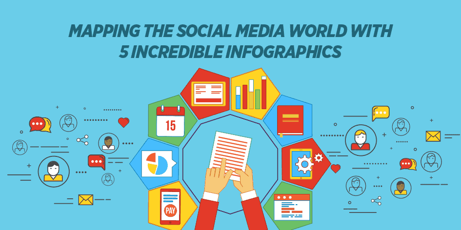
Nevertheless, it’s an excellent exercise to take a look at how these networks and platforms are being mapped by some of today’s top digital strategists.
For one thing, you might find a new platform that’s just perfect for your brand. But just as importantly, you’ll be able to see how these various social networks are fitting together, and what role they’re playing in changing the way we consume content, communicate, and connect.
These #infographics give you a bird’s eye view of 201’7’s #socialmedia landscape. Share on X
The Conversation Prism 5.0 – Brian Solis and JESS3
By far the most complex and richest infographic on this list, the Conversation Prism is a stunning breakdown of the social media world that digital analyst Brian Solis, working with graphic design firm JESS3, began putting out in 2008.
It’s been updated over the years, with the latest version coming out in 2017.
(You can see the full-size version in this Mashable article, or download it at conversationprism.com.)
So how should you use this all-encompassing map? There are plenty of options, some of which are included in the Conversation Prism site. Here are a few more ideas.
- Gain an aerial view of your social strategy.
One of the most effective uses of this infographic is to use it to inform a big-picture view of your own social strategy. Which social networks are you using, and what categories do they fall into? Are there other categories you should be branching out into? - Use it to make sure you’re keeping up with trends. By looking at the older versions of the Conversation Prism, you can see how social media has changed over the years. This year, for instance, Solis added the categories messaging, crowdfunding, travel and hospitality, and connecting IRL. While crowdfunding and messaging have been around for a while (the Prism was last updated in 2013), connecting IRL – or In Real Life – is a relatively new focus for social media, and one that’s being emphasized more and more. You can see it in new social networking apps like Shapr, which aims at helping business professionals network online, then meet in real life.
- Use it as a brainstorming kickstarter. One of the great things about this infographic is how it showcases the connections between the goals or purposes of social media – engage, learn, listen, etc. Take one of these goals as a starting point to brainstorm a new campaign or new piece of content.
The Biggest Influencer Marketing Statistics, by Mediakix
Influencer marketing IS social media marketing – just in a different form. All you have to do is look at this mega-infographic by Mediakix to see just how important influencer marketing is to your social media efforts.

Influencer marketing continues to grow in importance, especially with younger consumers (or “digital natives”) like Generation Z.
Consumers in general, however, are leaning toward trusting influencers more than they do celebrities. So it’s a good idea to embrace influencer marketing no matter who your target demographics are.
2017 Social Media Cheat Sheet by Social Media Week
Ok, so this one isn’t exactly mapping social media – but it certainly is helpful.
Keep this Social Media Week infographic handy for when you’re posting to your profiles, and you’ll always know how big to make your images and when to push your posts live.
See the full infographic at Social Media Week
2017 Social Media Map by Overdrive Interactive
For those of us who prefer text to visuals – yes, we do exist! – this comprehensive infographic offers a wide-ranging overview of the state of the social media world.
Like the Conversation Prism, this map can help you discover new networks and platforms that might be a good fit for your brand. It’s also useful for spotting new trends and developing cross-pollination tactics for your content.
World Map of Social Networks by Vincenzo Consenza
Let’s end with a literal map:
This World Map of Social Networks is great for international brands that trying to set the broad strokes of their digital marketing plans.
As you can see, Facebook dominates the map – which isn’t surprising. It’s helpful to know that a Facebook post (or paid social ad) is still among the best ways to reach your customers, whether they’re in Nebraska or Mongolia.
Inspired to make your own infographics after looking at these? Read our post “The Rise of Visual Content Marketing: 5 Reasons Infographics Rock.”