

Earlier this year, Twitter unveiled its new analytics platform, promising to give users greater insight into their social media footprint than ever before. Although marketing companies have been using SEO optimization tools for many years to analyze and increase their clients’ visibility on search engines, it has taken many years for this technology to be adapted to the social networking phenomenon.
Twitter’s new software combines the best of both worlds, so to speak, by giving users free access to the most personalized analytical software on social media so they can improve their visibility online. By merging aspects of existing SEO optimization programs with modern social networking platforms, Twitter has provided users with personalized, in-depth data about their influence on Twitter and beyond.
All of the data collected by Twitter is compiled in one easily navigable dashboard, and all of it can be exported into a spreadsheet for further use. Below, we’ll explore how this information can be utilized to optimize users’ experience.
1. Tweets
On the analytics dashboard, the data is divided into three tabs. The first tab collects information about the user’s Tweets, Twitter’s primary avenue of communication. Similar to their previous analytics platform, Twitter’s new software tracks a Tweets’ impressions (the number of times a Tweet is viewed) and engagements (the number of times a user has interacted with a Tweet via clicks, retweets, replies, and follows).
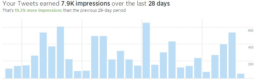
Together, impressions and engagements give users an idea of how frequently others read and interact with their Tweets. In other words, do people read a user’s Tweets and move on, or do they often feel the need to share it with others? This is known as the engagement rate. By dividing the total number of engagements over the total number of impressions, Twitter condenses this information into a single number in order to give users a better idea over how their Tweets influence others. The greater the engagement rate, the greater the influence of a user’s Tweets.
2. Followers
The second tab of the analytics dashboard displays information about a user’s followers. A line graph illustrates the number of followers over time, giving users an idea of when they lose and gain followers. Increases and decreases often correspond with real-world events. Professional athletes, for example, might gain followers during a particularly good season, whereas politicians may lose followers during a recession or after a scandal.
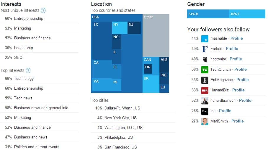
The second tab also groups users’ friends according to the most popular and most unique interests. This information gives users a better idea of the type of people that follow them and why. For instance, if a user posts frequently about baseball and video games but has more followers among gamers, perhaps the user creates better Tweets about video games than baseball. To increase the size of their audience, users can tailor their content towards their followers’ interests. By extension, this will also increase users’ impressions, engagements, and engagement rate.
In addition to grouping followers by interests, Twitter’s analytics also sorts followers according to location and gender, providing users with a better idea of who their audience is. The software also provides suggestions for users to follow based on who their friends follow, making it easier to network among Twitter users with similar interests.
3. Twitter Cards
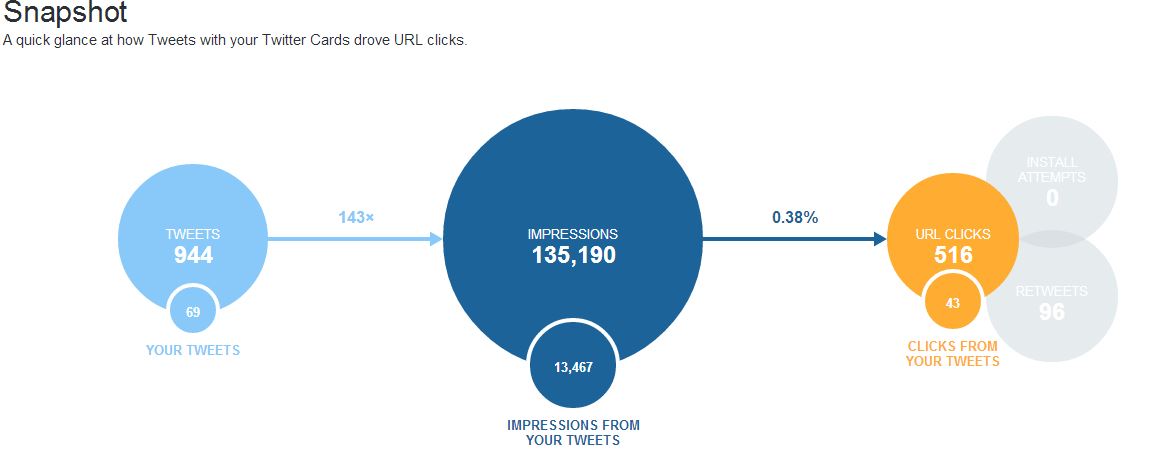
The third tab of the dashboard is concerned with measuring the effectiveness of a user’s Twitter Cards. Comprised of a photo or video and no more than 140 characters, Twitter cards are used to direct Twitter traffic to users’ external websites and advertise apps, products, events, etc.
In order to gauge the effectiveness of Twitter Cards, the analytics software gathers data about the number of URL clicks and installation attempts from a card, as well as the number of times it was retweeted. For each of these, there are accompanying graphs that measure the variation in card types, links from Twitter Cards, tweets, influencers, sources, and change over time. A ‘snapshot’ graph is also included to allow users to condense this information and visualize it in one graph.
Although Twitter’s new analytics platform gives users more precise and personalized feedback than ever before, it has not been free of criticism. Some people are concerned that stat-hungry users may begin to consciously or subconsciously tailor their content to increase their numbers, the Twitter equivalent of stat padding.
However, many of the more human aspects of Twitter cannot be tangibly measured or graphed. The humor, originality, and compassion users communicate in 140 characters or less is one of Twitter’s most unique features. Combined with human creativity, Twitter’s new analytics software allows users to make the most out of their Twitter experience.


